The Middle-earth mock transit notices that are sweeping the New York metro
Since January 2013, a graphic artist going under the alias “William Puck”, has been pasting mock travel notices all across the New York transit system. He’s up to more than 200 different notices now, and they’ve all used a single theme — Middle-earth.
TheOneRing.net chatted with the mysterious Mr Puck to find out more about himself and his work. Read on, and discover what he had to say — and see some of the examples of his guerilla-style, street art as well.
TORn: Tell us a little bit about yourself. The cliff notes version, I guess, although I am sure you don’t want to give away too much!
I grew up in Connecticut and came to New York City to go to art school back in the mid ’80s. I studied illustration and animation. I’ve been here ever since.
TORn: Why “William Puck”?
I needed a street name for the work I was about to do. The MTA has a strict policy against anyone putting posters in the subways, so using my real name would have been unwise. I wanted a name that was short, identifiable and had a little bit of mischief to it.
I chose the name “Puck” from my favorite William Shakespeare play, A Midsummer Night’s Dream. I was about to misdirect and baffle viewers just like Puck did. And for fun, I added William as my first name.
TORn: How long have you been working as a graphic artist?
I’ve been making art professionally for around 25 years or so.
TORn: How did you become interested in Tolkien, The Lord of the Rings and the Hobbit? What drew you to them and what do you like about them?
I must have been around 11 years old. A close neighbor of ours had a copy of “The Hobbit” on vinyl and gave it to me to listen to. It was a four-album set read by the amazing actor, Nicol Williamson. I listened to it over and over again for about five months. I was hooked. Then the Rankin / Bass animated special premiered on TV in late November 1977. My eyes were glued to the set that night. The design of Gollum was fantastic and his voice — by Brother Theodore — was perfect! I started reading the books soon after, and I re-read them every few years or so. Now I love the films as well.
My love for the books stems from Bilbo’s and Frodo’s journeys. These two unassuming, gentle people are thrown into the biggest threat facing the world. By all logic, they should have been trampled and killed by the forces of evil. But their inner strength, compassion and friendship carry them through to the end, changing the course of the world for good. They give us the greatest gift there is — hope.
TORn: Was there a particular trigger that made you want to spoof the MTA posters
using Tolkien’s Middle-earth? Why Middle-earth in particular?
I had been thinking of doing some kind of art-work in the subway. I didn’t want to just put up a marker tag or sticker because it seemed too easy. I wanted to do something more challenging.
I observed that the MTA (Metropolitan Transportation Authority) was putting up a lot of advisory notices in the stations. People sometimes read them and sometimes didn’t — but everyone had to pass by them. That’s what inspired me to create the posters. I would mimic this phenomenon — place art in front of commuters who would have to look at it directly to see it’s true nature.
“But, what to post?” I asked myself. Other artists had put up fake advisory signs in the past. What could I do that was different? I spent days racking my brain and came up with nothing. So, I shelved the idea.
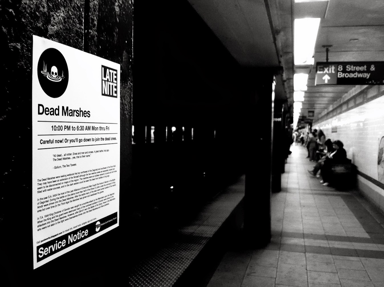
 Dead Marshes by William Puck.
Then one day, I was on the R train and had to be somewhere at 6pm. I had very little time and the train I needed to take was more messed up than usual: there was a delay because of a sick passenger … I had to wait to transfer to another train, but that train had mechanical problems … I had to take an express train past my stop and then had to back track to my original destination …
Finally, I climbed the stairs out of the station and into fresh air. I got to where I needed to be with moments to spare. Walking down the street I thought, “My God! Frodo and Samwise had it easier traveling to Mount Doom to destroy the One Ring, than I did traveling the subway today.” Of course, that is a complete exaggeration. But still, I was inspired. Every time I take the subway, it is an adventure. The Hobbit and The Lord of the Rings are considered the ultimate adventures stories. It just clicked right then and there for me.
I started looking at subway notices differently in the days that followed.
Instead of: “Because of a broken rail, there will be track work this weekend. Expect delays and take the 4 or 5 as an alternative route”; I saw: “Because of high Goblin activity, expect delays in service. Take an Eagle as an alternative route.”
TORn: Tell us a bit about the first poster you made. What made you choose that approach? What were your thoughts when you posted it up? Did it get much attention?
The first poster was: CAUTION: High Goblin Activity In These Areas!
It took a couple of days to finish. I had taken photos of some of the MTA notices and even found one or two in the trash. By having those as reference, it was easy to build a template that could be used over and over without too much fuss.
Once the poster was done, I ran to the copy store and had five or six made up. I headed to the closest subway station and started putting them up. My heart was racing. I tried to be discreet and as quick as possible. “This is crazy!” I thought. “You’re going to get caught!” I calmed down and went to the next station. It became easier and easier.
When I checked the posters later in the day, they were all gone — perhaps taken down by MTA workers or by someone who appreciated them.
Although I had just started, I knew that I had to keep making more. I also started taking pictures to document the process so that more people could get a chance to see one.
Then one day The Gothamist wrote an article. People were starting to take notice. Hopefully more and more will.
TORn: What you think of it now?
Ha! Looking back at that first poster now, I really hate it! It had so many flaws, the printing was bad, the map graphics were weak, etc.
Recently, I redesigned it. I think the new one is better.
I try to make each poster interesting. Some work, some don’t. Some happen in a flash; others need time to be worked on. There is really no right answer, and that’s what I love about the process. Street art doesn’t have to be finished by a certain time or date. It just happens. You learn from what you’ve done and move on to the next piece.
My inspiration comes form the MTA’s postings. I see potential in every sign they make. It forces me to come up with a concept each time I see a new one.
TORn: How long do they generally take to create?
Now that I have templates, some are completed in an hour or so. Some can take a week or two with tweaking and refining. The biggest task is coming up with an idea. The execution is the easy part. Right now, I’m working on some more special event posters. I’m creating one for Durin’s Day and that’s in both English and in Dwarvish, so it’s taking me a little longer then most.
TORn: Can you map out the creative process and the planning involved, from concept to finished work, for us?
I take photos of MTA postings I come across around the city. I write down an idea on my phone, maybe do a sketch. Then I create the design. I use a local copy shop for printing, stamp each piece on the back with a watermark for copyright protection and add double-sided tape to the back corners.
Once I’ve created the posters, the real work begins. Finding the right location for people traffic is a science. I have to be quick and careful. I put up the piece and take a few pictures. Then I post the photos to Twitter and Instagram, so fans can find them. Some stay up for a few days, others are gone in minutes. There’s a kind of beauty in that.
I’ve asked that people leave them up when they find one. Or if they feel compelled to take a poster, to please take a picture of it and let me know where you found it. A few fans have done this. At least I know the work found a good home and has not landed in a trash bin.
TORn: I’d love if you could briefly profile for us a couple of posters that you especially like.
The Special Event: Mirkwood Elves Lunar New Year is one of my top favorites. It was challenging to do it in both English and Tengwar. Plus, the posters were up for days and days. I plan on doing more with this theme.
But my favorites are the PUCK Middle-earth Cards. They are a lot of fun to place in and around the subways. They are the smallest pieces I’ve done. I call them the “Halflings” of my Middle-earth series. Small and unassuming, I place them on benches, turnstiles, train seats and metro machines. When found, people usually think they are real Metro cards. Upon further viewing, they realize what they truly are: little pieces of art that they can put in their pocket or wallet. How cool is that?
TORn: Do you intend to continue? How many possible posters do you think you can come up with?
Yes, I intend to continue this Middle-earth Transit series. Both the books and films continue to inspire me all the time.
But, I do have other ideas I want to explore. They won’t necessarily be Tolkien-related. I’m interested in travel, time and space and want to keep challenging the viewer about what it means to go on a journey. I’m not following a set map. I’m just heading out the door to see where the road takes me.
As Bilbo said [in the movie], “I’m going on an adventure!”
Readers can follow, and comment upon William Puck’s artworks on his Blogspot called PUCK WORKS. He also has a Google-plus account, a Twitter and an Instagram.
I grew up in Connecticut and came to New York City to go to art school back in the mid ’80s. I studied illustration and animation. I’ve been here ever since.
TORn: Why “William Puck”?
I needed a street name for the work I was about to do. The MTA has a strict policy against anyone putting posters in the subways, so using my real name would have been unwise. I wanted a name that was short, identifiable and had a little bit of mischief to it.
I chose the name “Puck” from my favorite William Shakespeare play, A Midsummer Night’s Dream. I was about to misdirect and baffle viewers just like Puck did. And for fun, I added William as my first name.
TORn: How long have you been working as a graphic artist?
I’ve been making art professionally for around 25 years or so.
 |
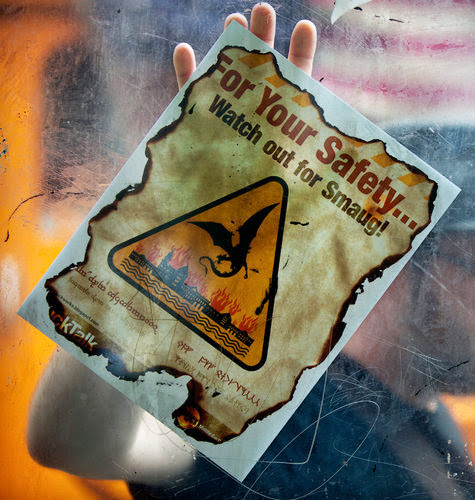
| For Your Safety... Watch out for Smaug! |
TORn: How did you become interested in Tolkien, The Lord of the Rings and the Hobbit? What drew you to them and what do you like about them?
I must have been around 11 years old. A close neighbor of ours had a copy of “The Hobbit” on vinyl and gave it to me to listen to. It was a four-album set read by the amazing actor, Nicol Williamson. I listened to it over and over again for about five months. I was hooked. Then the Rankin / Bass animated special premiered on TV in late November 1977. My eyes were glued to the set that night. The design of Gollum was fantastic and his voice — by Brother Theodore — was perfect! I started reading the books soon after, and I re-read them every few years or so. Now I love the films as well.
My love for the books stems from Bilbo’s and Frodo’s journeys. These two unassuming, gentle people are thrown into the biggest threat facing the world. By all logic, they should have been trampled and killed by the forces of evil. But their inner strength, compassion and friendship carry them through to the end, changing the course of the world for good. They give us the greatest gift there is — hope.
TORn: Was there a particular trigger that made you want to spoof the MTA posters
using Tolkien’s Middle-earth? Why Middle-earth in particular?
I had been thinking of doing some kind of art-work in the subway. I didn’t want to just put up a marker tag or sticker because it seemed too easy. I wanted to do something more challenging.
I observed that the MTA (Metropolitan Transportation Authority) was putting up a lot of advisory notices in the stations. People sometimes read them and sometimes didn’t — but everyone had to pass by them. That’s what inspired me to create the posters. I would mimic this phenomenon — place art in front of commuters who would have to look at it directly to see it’s true nature.
“But, what to post?” I asked myself. Other artists had put up fake advisory signs in the past. What could I do that was different? I spent days racking my brain and came up with nothing. So, I shelved the idea.
Then one day, I was on the R train and had to be somewhere at 6pm. I had very little time and the train I needed to take was more messed up than usual: there was a delay because of a sick passenger … I had to wait to transfer to another train, but that train had mechanical problems … I had to take an express train past my stop and then had to back track to my original destination …
Finally, I climbed the stairs out of the station and into fresh air. I got to where I needed to be with moments to spare. Walking down the street I thought, “My God! Frodo and Samwise had it easier traveling to Mount Doom to destroy the One Ring, than I did traveling the subway today.” Of course, that is a complete exaggeration. But still, I was inspired. Every time I take the subway, it is an adventure. The Hobbit and The Lord of the Rings are considered the ultimate adventures stories. It just clicked right then and there for me.
I started looking at subway notices differently in the days that followed.
Instead of: “Because of a broken rail, there will be track work this weekend. Expect delays and take the 4 or 5 as an alternative route”; I saw: “Because of high Goblin activity, expect delays in service. Take an Eagle as an alternative route.”
 |
For your safety... Avoid The Nazgul! by William Puck. |
The first poster was: CAUTION: High Goblin Activity In These Areas!
It took a couple of days to finish. I had taken photos of some of the MTA notices and even found one or two in the trash. By having those as reference, it was easy to build a template that could be used over and over without too much fuss.
Once the poster was done, I ran to the copy store and had five or six made up. I headed to the closest subway station and started putting them up. My heart was racing. I tried to be discreet and as quick as possible. “This is crazy!” I thought. “You’re going to get caught!” I calmed down and went to the next station. It became easier and easier.
When I checked the posters later in the day, they were all gone — perhaps taken down by MTA workers or by someone who appreciated them.
Although I had just started, I knew that I had to keep making more. I also started taking pictures to document the process so that more people could get a chance to see one.
Then one day The Gothamist wrote an article. People were starting to take notice. Hopefully more and more will.
TORn: What you think of it now?
Ha! Looking back at that first poster now, I really hate it! It had so many flaws, the printing was bad, the map graphics were weak, etc.
Recently, I redesigned it. I think the new one is better.
 |
| High Goblin Activity by William Puck. Old version |
 |
| Original poster for the LIRR Cannonball Express. |
 |
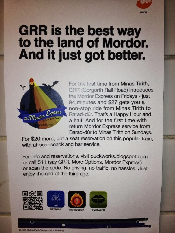
| GRR is the best way to the land of Mordor by William Puck. |
TORn: You’ve made more than 200 now. What is it that you try to achieve when you develop a piece? How do you draw inspiration?
My inspiration comes form the MTA’s postings. I see potential in every sign they make. It forces me to come up with a concept each time I see a new one.
TORn: How long do they generally take to create?
Now that I have templates, some are completed in an hour or so. Some can take a week or two with tweaking and refining. The biggest task is coming up with an idea. The execution is the easy part. Right now, I’m working on some more special event posters. I’m creating one for Durin’s Day and that’s in both English and in Dwarvish, so it’s taking me a little longer then most.
TORn: Can you map out the creative process and the planning involved, from concept to finished work, for us?
I take photos of MTA postings I come across around the city. I write down an idea on my phone, maybe do a sketch. Then I create the design. I use a local copy shop for printing, stamp each piece on the back with a watermark for copyright protection and add double-sided tape to the back corners.
Once I’ve created the posters, the real work begins. Finding the right location for people traffic is a science. I have to be quick and careful. I put up the piece and take a few pictures. Then I post the photos to Twitter and Instagram, so fans can find them. Some stay up for a few days, others are gone in minutes. There’s a kind of beauty in that.
I’ve asked that people leave them up when they find one. Or if they feel compelled to take a poster, to please take a picture of it and let me know where you found it. A few fans have done this. At least I know the work found a good home and has not landed in a trash bin.
TORn: I’d love if you could briefly profile for us a couple of posters that you especially like.
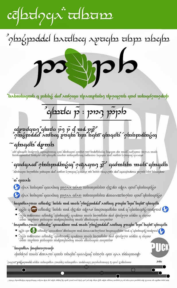
The Special Event: Mirkwood Elves Lunar New Year is one of my top favorites. It was challenging to do it in both English and Tengwar. Plus, the posters were up for days and days. I plan on doing more with this theme.
 |
| Mirkwood Elves Lunar Year - Tengwar. |
But my favorites are the PUCK Middle-earth Cards. They are a lot of fun to place in and around the subways. They are the smallest pieces I’ve done. I call them the “Halflings” of my Middle-earth series. Small and unassuming, I place them on benches, turnstiles, train seats and metro machines. When found, people usually think they are real Metro cards. Upon further viewing, they realize what they truly are: little pieces of art that they can put in their pocket or wallet. How cool is that?
TORn: Do you intend to continue? How many possible posters do you think you can come up with?
Yes, I intend to continue this Middle-earth Transit series. Both the books and films continue to inspire me all the time.
But, I do have other ideas I want to explore. They won’t necessarily be Tolkien-related. I’m interested in travel, time and space and want to keep challenging the viewer about what it means to go on a journey. I’m not following a set map. I’m just heading out the door to see where the road takes me.
As Bilbo said [in the movie], “I’m going on an adventure!”
Readers can follow, and comment upon William Puck’s artworks on his Blogspot called PUCK WORKS. He also has a Google-plus account, a Twitter and an Instagram.


0 comments:
Post a Comment